

"Design isn’t just about how things look—it’s about how they make people feel."
I'm Alaa Khalifa, a graphic designer, photographer, and educator with a deep passion for visual storytelling. With over a decade of experience in higher education, I’ve had the opportunity to mentor aspiring creatives while honing my own craft. I hold an MA in Graphic Communication from Hertfordshire University, and my work has been featured in exhibitions, art magazines, and even displayed in Times Square. Whether I’m designing, teaching, or capturing moments through photography, I strive to create meaningful and impactful visuals that connect with people on a deeper level.
I invite you to explore my website and discover my journey through design and photography.
PERSONAL BRANDING

I chose the Ace of Spades as my symbol because it represents power, success, and resilience—qualities I embody in my work. My branding conveys a clear message: choose me, and you choose the winning card.
Logo Icon Design:
My logo is a reflection of my creativity, excellence, and personal identity. Featuring a minimalist portrait, including my signature glasses, it establishes authenticity and a strong personal connection.
Color Palette Update:
Inspired by pop art and cubism, I’ve updated my logo with bold, vibrant colors, predominantly purple, symbolizing creativity, originality, and innovation. These hues reflect my fearless approach to design and my commitment to pushing boundaries.
Signature Update:
I've introduced a new original signature, reinforcing my individuality and dedication to leaving a personal mark on every project.
Business Card Design:
The back of my business card now features a simplified cubism-inspired pattern, reflecting my unconventional, boundary-pushing creative style.
This evolution in my branding highlights my bold, innovative approach and unwavering commitment to authenticity and excellence.
-
![]()
Personal logo & Business Card
-
![]()
Personal logo & Business Card
-
![]()
Personal logo & Business Card


ILLUSTRATIONS


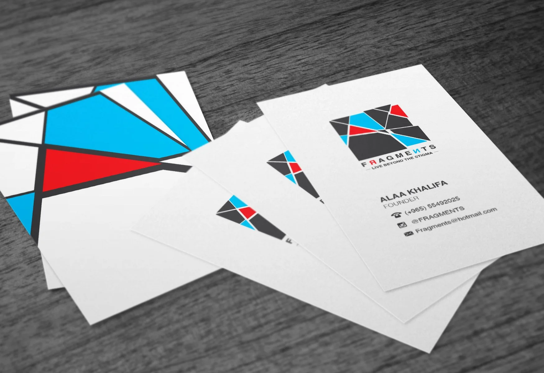
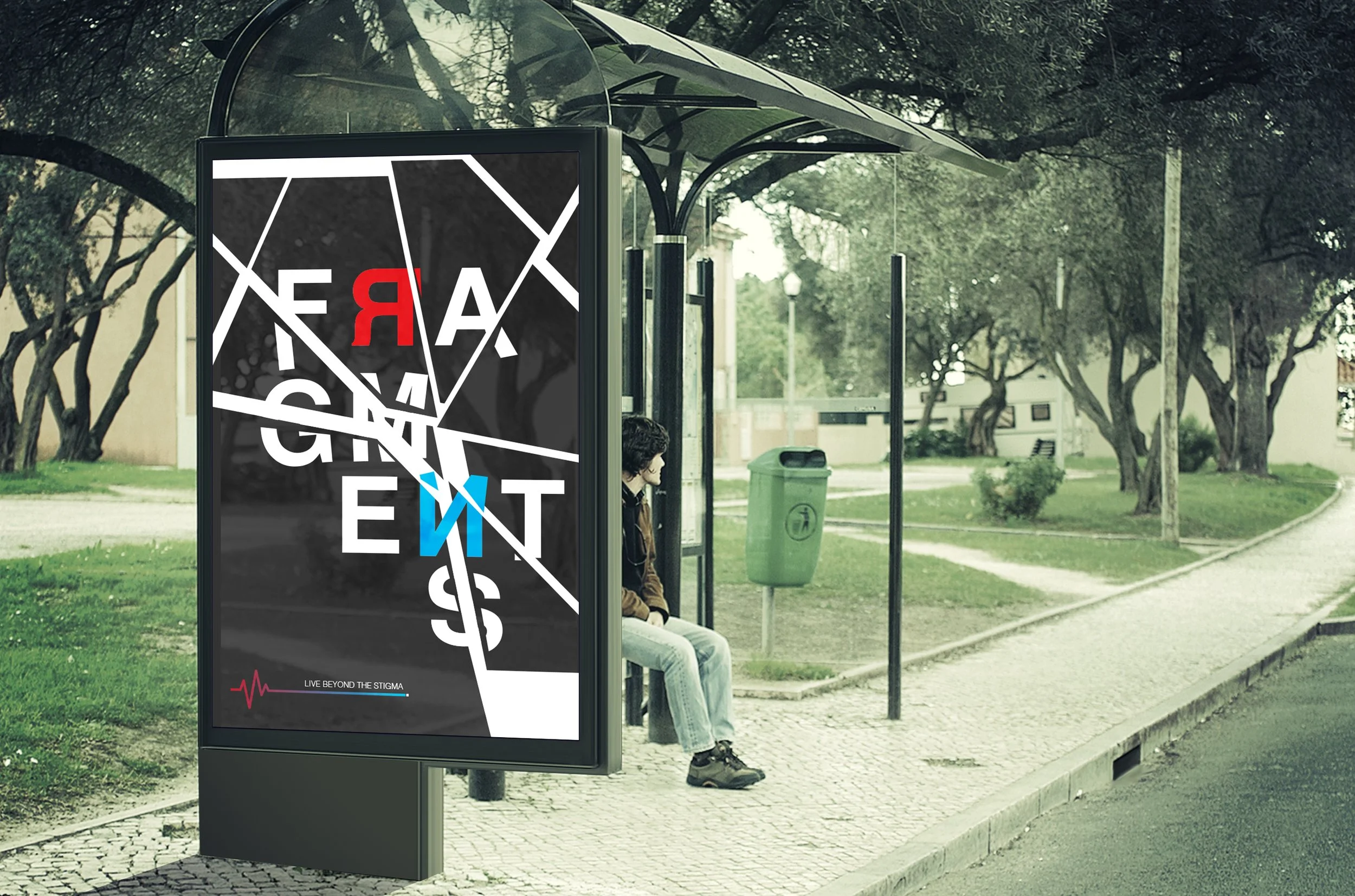
The logo for "FRAGMENTS" features shattered pieces that represent the fragmented state of mind that many people with bipolar disorder experience. The pieces could also represent the different emotions and mood swings that come with the condition, which can be confusing and overwhelming for people with bipolar disorder. The R and N letters flipped in the logo represent the manic and depressive poles that people with bipolar disorder may swing between like a pendulum.
The color scheme includes shades of blue, which is commonly associated with mental health awareness campaigns. The use of blue can help to convey a sense of calmness that comes with depressive emotions. The red color, on the other hand, symbolizes energy, passion, anger, and irritation, which represents the manic episodes that often accompany bipolar disorder.
The slogan "Live Beyond the Stigma" for a bipolar disorder awareness campaign effectively communicates the message of breaking down the negative stereotypes and misconceptions that often accompany the condition. The slogan encourages people with bipolar disorder to move past the negative connotations and to live their lives to the fullest, despite the challenges they may face.
The use of the word "live" suggests that people with bipolar disorder can lead fulfilling and meaningful lives, while the phrase "beyond the stigma" emphasizes the idea of breaking down the barriers that exist due to negative stereotypes and misconceptions. By living beyond the stigma, people with bipolar disorder can show that they are more than just their diagnosis and can overcome the challenges they face.
This slogan is also impactful because it inspires both those living with bipolar disorder and society as a whole to move past the negative connotations and toward greater understanding and acceptance of the condition. The use of a simple, direct, and memorable phrase makes the slogan easily understandable and helps to spread the message of the campaign.

FRAGMENTS
-
![FRAGMENTS Business Card]()
FRAGMENTS Business Card
-
![]()
Booklet
-
![]()
FRAGMENTS Poster
Description goes here -
![]()
FRAGMENTS Logo


ARABIC LOGO DESIGN

I designed an elegant Arabic calligraphy logo for a client, featuring a hand-drawn script that blends tradition with sophistication. The bold, fluid typography incorporates intricate curves for a dynamic feel. A gold palette conveys luxury, complemented by a rich brown background for warmth and stability. This design merges timeless calligraphy with a modern aesthetic, reflecting the brand's values and aspirations.
DRESS CODE PROJECT

The Dress Code Project is a curated magazine showcasing the work of artists from around the world. Designed with a modern and minimalist approach, the layout emphasizes clarity and visual balance, allowing each artist's work to take center stage. The booklet adopts a square format, enhancing its contemporary aesthetic and offering a fresh, structured presentation.

ZEN-TANGLE ART
Zentangle is more than just drawing—it is a meditative art form that transforms simple, structured patterns into intricate, mesmerizing designs. Rooted in mindfulness, Zentangle allows the artist to embrace the flow of creativity, one stroke at a time, without the need for perfection or pre-planning.
Each of my Zentangle pieces is a reflection of calmness, focus, and artistic expression. Using repetitive patterns, organic shapes, and delicate details, I create compositions that invite you to explore balance, movement, and harmony. Whether viewed as a form of relaxation, self-expression, or simply a visual escape, Zentangle art is a reminder of the beauty found in simplicity.


MATCHBOX CONCEPT
"Ghostly Glow" is a modern and minimalist matchbox design that blends simplicity with a touch of eerie charm. Featuring a hand-drawn illustration of a classic sheet ghost holding a lit torch, the design captures a playful yet mysterious aesthetic. The message, "Illuminate the Unseen," reinforces the concept of bringing light to the unknown, whether it's a dark room or the hidden corners of imagination. The clean lines and monochromatic tones enhance the sophisticated yet whimsical appeal, making this matchbox not just a functional item but a small piece of art that sparks curiosity and warmth.


EX-TIC-TION
My poster is a monochromatic composition designed to convey the stark reality of ocean pollution. At the center, I've illustrated a meticulously detailed seahorse skeleton, symbolizing the fragility of marine life and the critical danger posed to endangered species. The choice of black and white intensifies the sense of loss and highlights the severity of the issue.
The word 'Extinction' is a focal point, creatively divided into 'Ex' and 'tinction.' This split emphasizes the concept of something that once existed ('Ex') and the tension of its impending disappearance ('tinction'). To reinforce the oceanic theme, I've applied a water ripple effect to the text, which distorts the word, symbolizing how pollution is warping and destroying life in our oceans.
This poster is a visual call to action, urging viewers to confront the devastating impact of human activities on marine ecosystems.


FINDING HOPE:
A TRIBUTE TO VINCENT VAN GOGH

As an artist who shares Vincent Van Gogh's battle with bipolar disorder and a profound connection to his art, this poster is my heartfelt tribute to his enduring legacy. Through my poster design, I seek to capture the emotional depth of Van Gogh's journey and the transformative power of his work.
In the depths of a dark blue background, reminiscent of Van Gogh's iconic "Starry Night" painting, the illustration of Van Gogh stands resolute on the right side of the poster. His sad eyes gaze out, conveying the emotional depth of his tumultuous journey.
Written in a bold serif font, Van Gogh's birth year takes prominence, a poignant reminder of his enduring legacy. A serif typeface was chosen to convey a timeless and vintage feel, aligning with the historical significance of Van Gogh's legacy. At the top of the poster, the date March 30 is prominently displayed, not only in tribute of Van Gogh's birthday, but also as World Bipolar Day, symbolizing the artist's shared struggle.
The illustration, designed in the minimalist Swiss style, keeps the focus solely on Van Gogh, allowing his emotional expression to captivate the viewer. Positioned on his chest is a vibrant sunflower, a symbol of hope that has been dear to me since childhood and later discovered to hold significant meaning in Van Gogh's paintings. I chose to place the sunflower where Van Gogh shot himself as a somber acknowledgment of his pain and suffering. However, it also represents my belief in finding peace and solace, even in the darkest moments.
Accompanying the illustration is a stirring quote from Van Gogh himself: "What would life be if we had no courage to attempt anything?" This quote resonates deeply with me, serving as a reminder of Van Gogh's unwavering courage and resilience in the face of adversity.
Through this illustration, I pay tribute to Van Gogh and acknowledge my shared experience with bipolar disorder. As an artist and designer, I empathize with what Van Gogh endured, and this poster is my way of honoring his journey. It speaks to the power of art to convey emotions and offer hope in challenging times.
FRIDA: FRAGMENTS OF RESILIENCE

As an artist deeply inspired by Frida Kahlo's ability to channel her pain into vibrant and transformative art, this poster is my heartfelt tribute to her enduring legacy. Through my design, I aim to capture the profound strength and resilience that defined Frida’s journey, celebrating her life as a testament to overcoming adversity with creativity and passion.
At the heart of the poster is a bold illustration of Frida Kahlo, framed by a palette of vivid, saturated colors that echo the spirit of her iconic works. Her birth year takes center stage at the top of the design, displayed in a clean sans-serif font, symbolizing the timelessness of her influence.
On the side, the name "Frida Kahlo" is intentionally fragmented—a visual representation of her struggles, including her battles with chronic pain and emotional hardship. This breakdown of her name reflects the fractures in her life that she transformed into art, creating something beautifully whole from the broken pieces.
The minimalist Swiss design approach emphasizes clarity and structure, drawing the viewer's focus to Frida herself and the poignant symbolism within the composition. This poster seeks to honor not only Frida Kahlo’s extraordinary art but also her resilience, strength, and unwavering spirit in the face of life’s challenges.

PHOTOGRAPHY
-
![]()
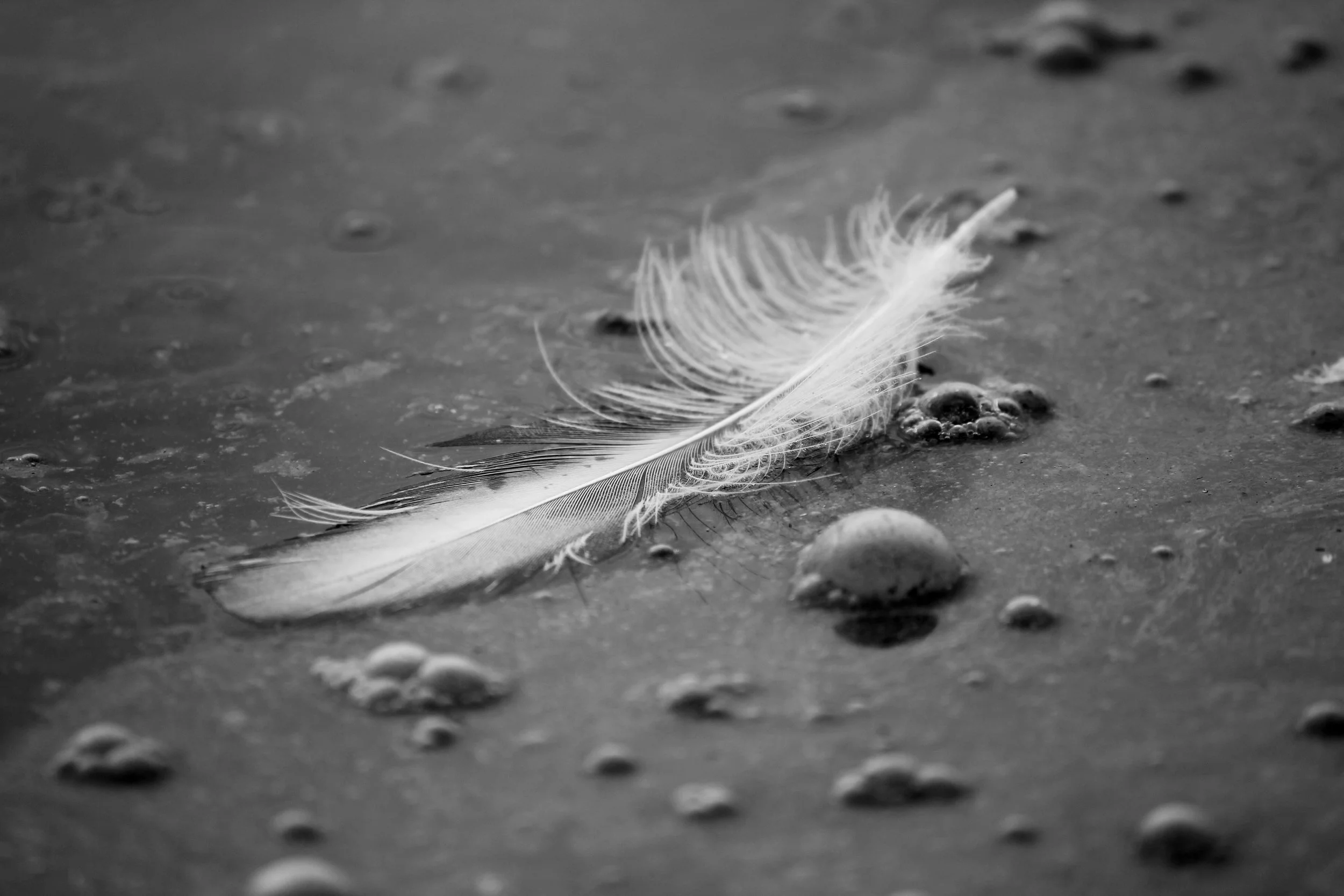
Morbid Tranquility
Tranquility – a state of peacefulness, calmness, and stillness. I named this piece Morbid Tranquility because it conveys two paradoxical themes. What we see in the photo is tranquil – a feather that peacefully fell from a migrating flamingo, calmly resting on a body of liquid. But the truth is morbid: the feather rests on a body of oil from a nearby refinery, and soon after the photo was taken, the feather was swallowed into the viscous oil. Morbid Tranquility reminds us that the beauty we see on the surface does not tell the whole story.
-
![]()
Elegy of the Forgotten Ward
In a timeless dance between light and shadows, this photograph captures a hauntingly beautiful scene that unfolds in the monochromatic realm of black and white. Titled "Elegy of the Forgotten Ward," the image transports viewers to a realm where history converges with artistry, revealing the silent narrative of an old, burnt hospital.
-
![]()
Sunset
A breathtaking sunset unfolds behind silhouetted palm trees and distant mountains, painting the sky with warm hues of gold and amber.
-
![]()
Peace
‘Peace’ captures the delicate beauty of a white lily in intimate detail, revealing its graceful curves and serene purity at the heart of nature.
-
![]()
Elegy of the Forgotten Ward 2
In a timeless dance between light and shadows, this photograph captures a hauntingly beautiful scene that unfolds in the monochromatic realm of black and white. Titled "Elegy of the Forgotten Ward," the image transports viewers to a realm where history converges with artistry, revealing the silent narrative of an old, burnt hospital.
-
![]()
Full Moon
A luminous full moon stands against the deep night sky, radiating quiet mystery and celestial beauty.


PROCREATE


The following artworks are created using the Procreate app, exploring various styles and techniques to bring unique artistic visions to life.


SOME AWARDS AND PUBLICATIONS


“Graphic design will save the world right after rock and roll does.”
― David Carson